Context & Role
As the UX/Product Designer, I originated the entire concept, idea, and design for Happy Bulletin—an online church bulletin platform born out of my passion for improving community connection and accessibility. Recognizing a real need, I took initiative to create this solution and collaborated with developers and ministry stakeholders to bring it to life, ensuring it met user needs and organizational goals.
Happy Bulletin was born as a solution to replace static PDFs or images with a fully responsive, browser-based digital bulletin, accessible on any device the moment someone walks through the door.
The Challenge
Traditional paper bulletins limited church communication—often hard to update, inaccessible to remote members, and lacking interactive features. The goal was to create an easy-to-use, accessible digital platform that fostered greater community connection.
Tools
- HTML, SASS/CSS (Flexbox + Grid)
- Figma
- Zoom
- Google Forms
Research & Insights
Through interviews and feedback sessions with church staff and members, I identified frustrations with existing bulletins and gathered ideas for features to enhance usability and engagement. Accessibility for all ages and tech levels was a critical focus.
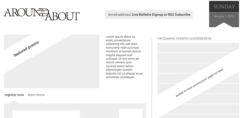
The original application design.
Design Approach & Solutions
I designed a clean, responsive web interface with straightforward navigation and customizable content areas. Using Figma, I created clickable prototypes to demo to stakeholders and test with users. Design tokens maintained consistent branding and streamlined development handoff.
Impact & Results
The new online bulletin improved accessibility and engagement across congregations, enabling real-time updates and interactive features like event RSVPs and prayer requests. User feedback showed increased satisfaction and connection with church communications.
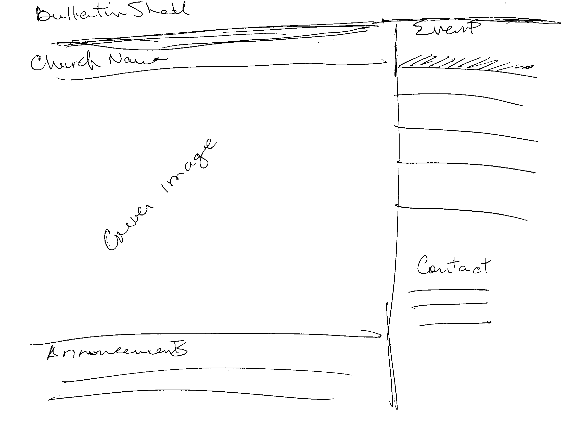
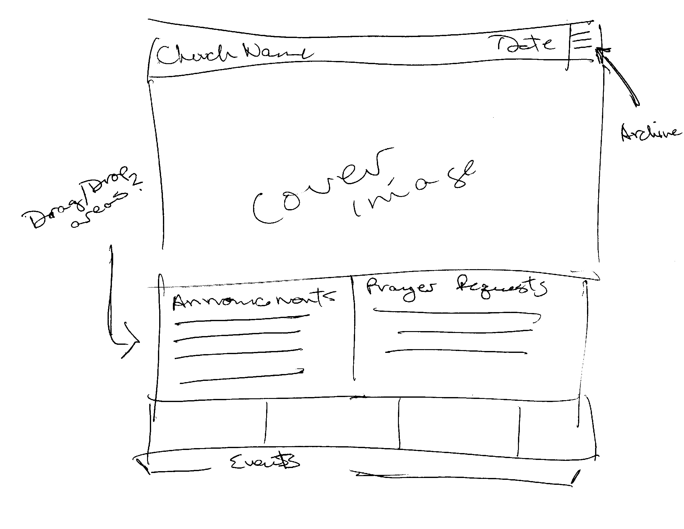
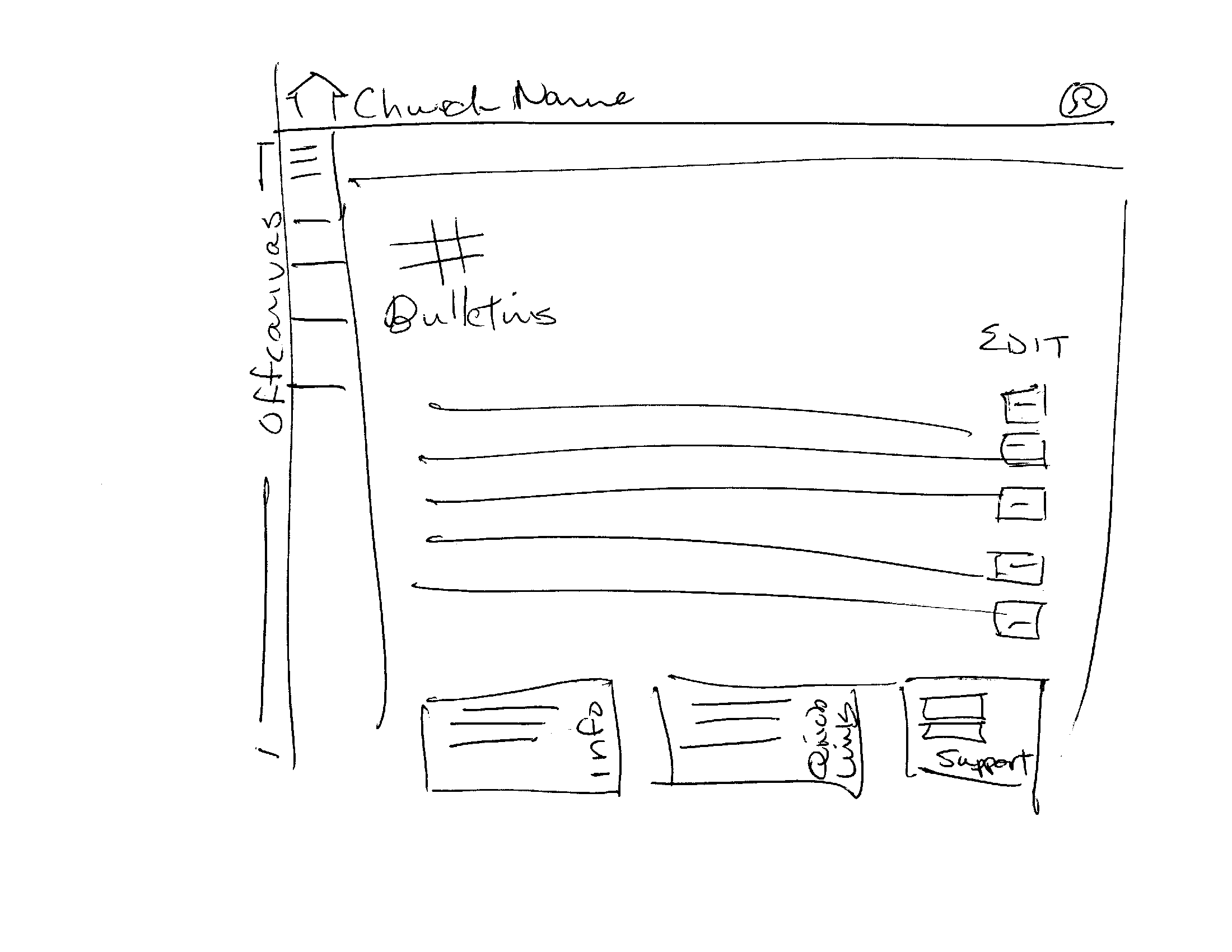
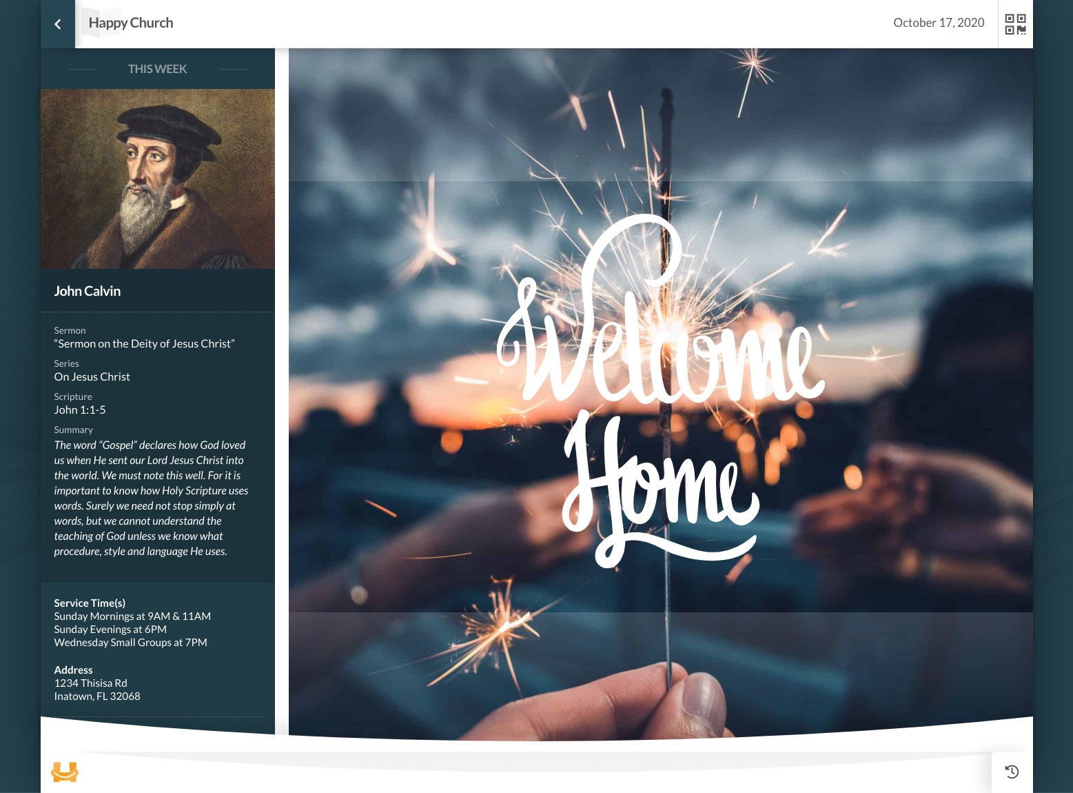
User-Facing
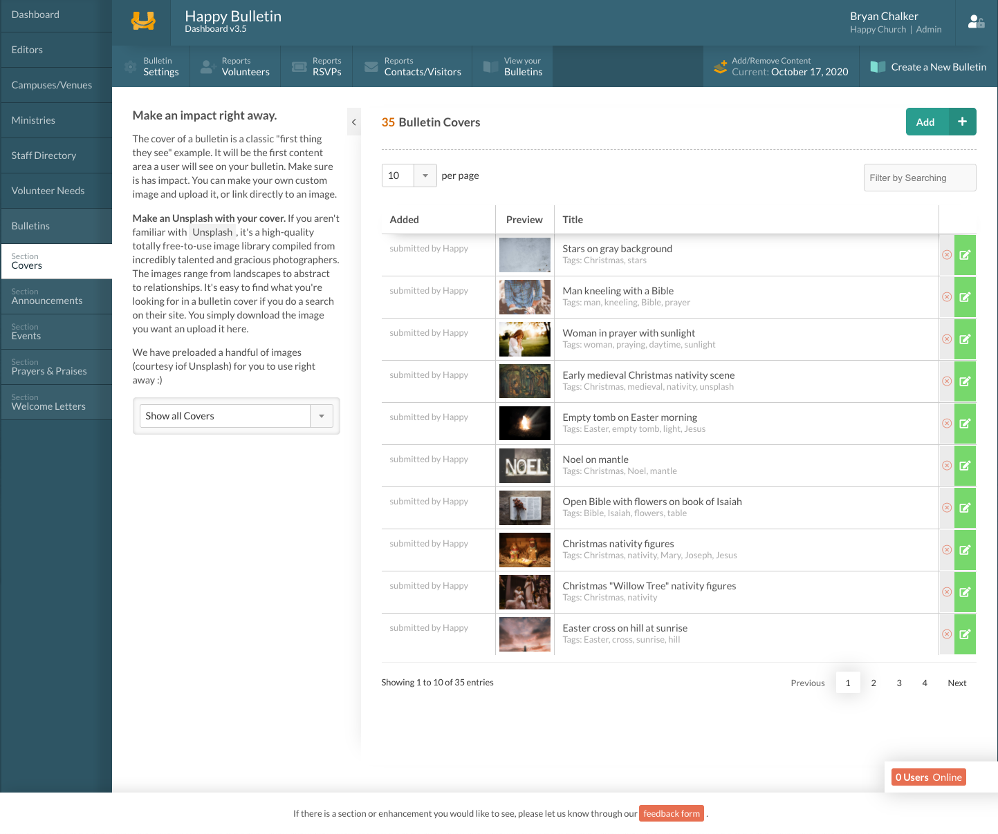
Admin Dashboard
Happy Bulletin was more than a design challenge—it was a deeply personal opportunity to bridge tradition and technology in a way that respects church culture while embracing digital efficiency. Designing for such a wide age and tech comfort range taught me to think more inclusively, and it reaffirmed the value of iterative, user-informed design—even on passion projects.
Embedded example bulletin below:


