Summary
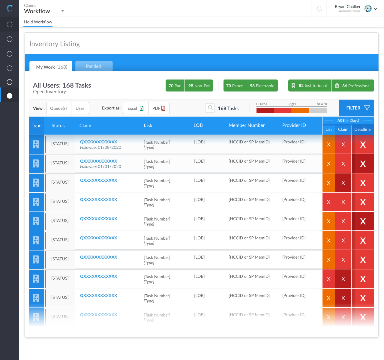
This “Inventory Listing” flow was for internal customers (employees). The goal was to bring primary data the user accessed, and segment it for their view accordingly.
Tools Used
Adobe XD
Font Awesome Pro 5 and 6
Project Date
2020 - 2022
Problem
Florida Blue has been using an antiquated (legacy) application to maintain its claims records. The current application (named “Diamond”) was primarily a table/data dump of details, which were segmented into various tabs for the users to view. If they wanted to dive into custom filters or see an aggregate view of information it was not possible without heavy (and costly) custom development time. “Diamond” had become a frustration to work with and an obstacle to accept if they wanted to get their work done.
Users
The users were claim reviewers. A reviewer looks over the details of a worked claim to insure things were not overlooked or worked incorrectly. The role-based personas took feedback from those in urgent and general roles. Each needed a bit of information shown/accessible to them, that the other roles either were not permitted to view or had no priority to access.
- General users were 90% of all users to this flow.
- Urgent users were a second tier assigned to follow claims that have been in the claims system for a long time. The ages for claims were pulled into a dashboard for reporting, that is not included with this flow.
Goals
- Able to interact with data quickly
- Snapshot of the claim age
- Single source of truth (trustworthy data)
- Able to complete work without opening multiple screens
Collaborators
The core team I worked with:
- 2 Front-end devs
- 1 QA (Quality Assurance) tester
- 2 SMEs (Subject Matter Experts)
- 1 BSA (Business Systems Analyst).
The BSA was the go-between for the other members.
Challenges
The users were used to a one-to-one flow and expected to visualize all the data that was made available to them in Diamond, on the new screens. They weren't used to having data tucked away and off-canvas, since Diamond had basically thrown all data (ungrouped and unprioritized) at them all the time. Getting them accustomed to quickly accessing reference data, while not leaving their active work screen, required adding the micro-interactions to the clickable prototypes we demoed.

Solution
The two Subject Matter Experts I consulted with during the planning phase of this project, were exceedingly open and detailed in their needs. One was general and the other was urgent. Both had been at Florida Blue for a few years, so they were aware of the current issues with Diamond. They were still new enough in their roles that they preferred efficiency and accuracy in their job over a comfortable flow they were able to "work around”. The primary reason for this is bonuses are directly tied to accuracy of the claims they were reviewing.
The “work[ing] around” was a key area I spoke to them about and the primary hurdle I wanted to address. I shadowed both of them during sessions in order to watch, track time, and view their body language and expressions as they did their work.
How it helped the problem:
Once I had wireframes built out for the new listing flow, I sat down with the SMEs (before the devs/QA/BSA) and went through the flows with them. I didn't tell them the flow, however, until I asked them to go through a series of tasks ("filter all of the professional claims", "find the oldest claims in your list", etc.). While the flow walkthrough went longer than I expected (due to the complexity of some of the tasks), the users were all much happier and much more excited to interact with this application. This continued as the wireframes moved to low-fi then high-fidelity prototypes. After the completion and launch of the application, the users remarked that they felt part of the process and appreciated this quite a bit.
How it affected the business
The efficiency provided by the inventory screens allowed two projects (which were in the preliminary phase, but budgeted for) to be cancelled. The screens were also utilized in a customized fashion with multiple other groups within the Claims domain. This allowed us to share the codebase and use the demo for getting the buy-in for those projects.
Outcomes
- Much faster research for auditors.
- Better organization for the claims and details users need to focus on.
- Ability to compare claim details on a high level. The previous listings for claims did not call out with temp gauges or details, important data points for them to see.


