


Context & Role
As the UX Product Designer and Consultant for Accruit, I led the UX strategy from research through prototyping to final design. Collaborating closely with a development team of six, we worked together to create an intuitive dashboard and intake submission form that encouraged self-service and reduced support demands.
The Challenge
The existing dashboard overwhelmed users with unclear data presentation and complex language, making it difficult to quickly grasp essential information. Similarly, the intake submission form was complicated to complete, causing frequent user errors and frustration. These issues led to high support ticket volumes and lowered user confidence.
Tools
- Figma
- Microsoft Teams
- Google Sheets
- Figjam
Research & Insights
Through user interviews and support data analysis, we uncovered critical usability and accessibility gaps. Findings highlighted the need for clear data snapshots and simpler, accessible language to empower users to navigate independently.
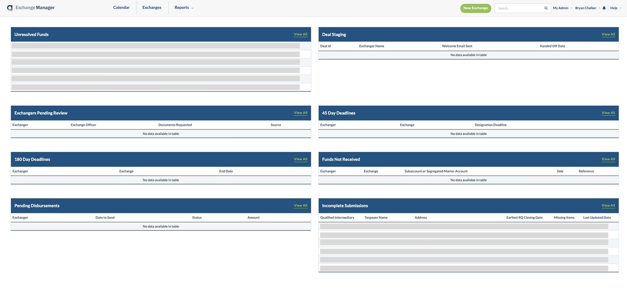
The original application design.
Design Approach & Solutions
In collaboration with the development team, I redesigned the dashboard to showcase key data in a clean, organized layout applying accessibility best practices. The intake form was simplified with plain language and a streamlined flow to reduce cognitive load. Using design tokens in Figma, I ensured consistent styling and a seamless handoff to developers, which accelerated implementation and minimized discrepancies. I created clickable Figma prototypes to demo designs to stakeholders and users, gathering valuable feedback that guided iterative refinements to usability and visual hierarchy.
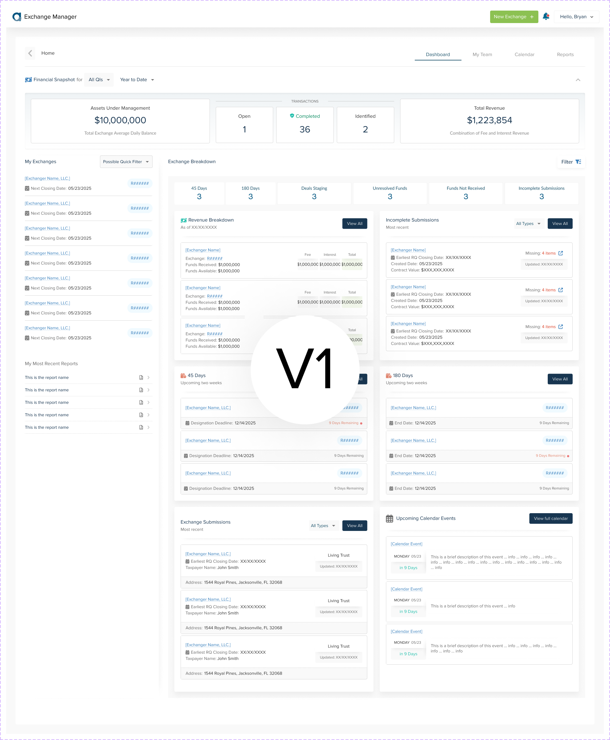
Initial redesign
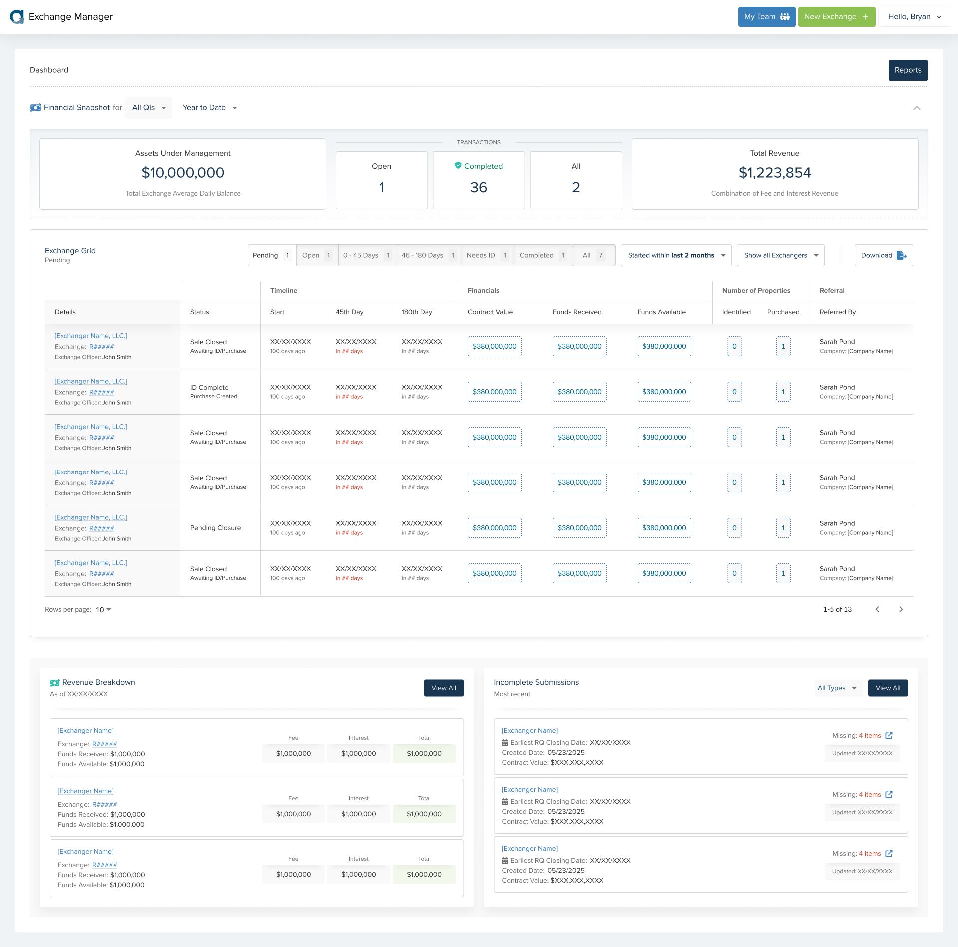
Final approved redesign.
Impact & Results
The redesign significantly reduced support tickets and boosted user satisfaction. Users could now easily understand their data and complete submissions confidently, increasing self-service adoption and freeing up support resources.
Learnings & Next Steps
This project reinforced the importance of tight UX-developer collaboration and efficient design handoff using design tokens. Future improvements will focus on further personalization and automation to enhance user efficiency.
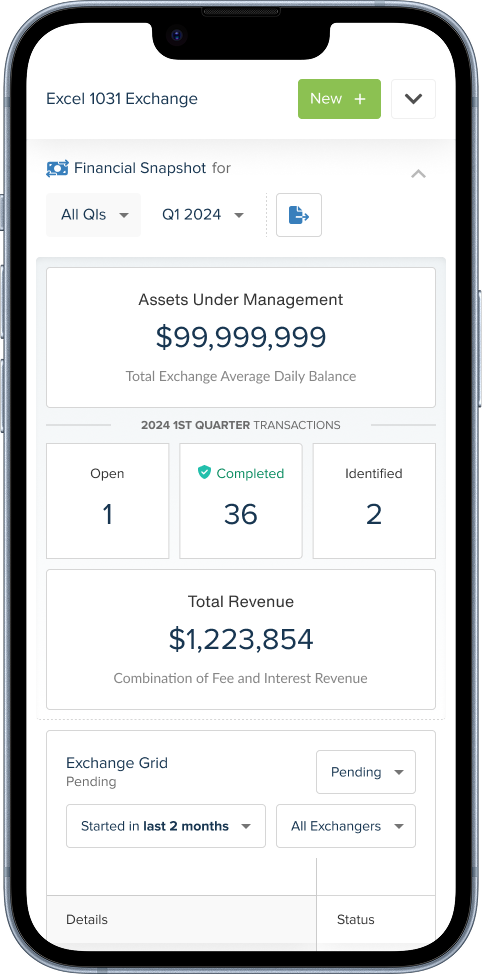
Final approved mobile redesign.
Mobile Version
For the first time, there is a mobile version of the application (streamlined) that users can leverage.
Reflection
This project reinforced the importance of ongoing user feedback, especially when redesigning legacy systems. It also demonstrated the need for strong cross-team communication when UX is new to an organization.
I’m proud that through thoughtful research and iteration, we delivered an application that better served both internal and external users—and laid the groundwork for a more user-centered culture at Accruit.